A well-crafted chart can make a 2% improvement look like a revolution, a flat trend look like exponential growth, and two unrelated variables look perfectly correlated. Darrell Huff’s 1954 classic “How to Lie with Statistics” first catalogued these tricks, and they are more relevant today than ever. Engineers create and consume data visualizations constantly: performance dashboards, test reports, benchmark comparisons, project metrics. Understanding how charts deceive is both a defense skill (spotting misleading claims) and a professional skill (presenting your own data honestly). #DataVisualization #CriticalThinking #HonestData
Trick 1: The Truncated Y-Axis
The most common and most effective chart deception. By starting the y-axis at a value other than zero, small differences appear enormous.
Imagine a bar chart comparing two MCU power consumption measurements: Chip A draws 48 mA and Chip B draws 52 mA. If the y-axis starts at zero, the bars look nearly identical (they differ by about 8%). But if the y-axis starts at 45 mA, Chip B’s bar appears roughly four times taller than Chip A’s bar. The visual impression is a massive difference when the actual difference is modest.
Misleading (y-axis starts at 45): Honest (y-axis starts at 0):
52| ████ 50| ████ ████
50| ████ 40| ████ ████
48| ████ ████ 30| ████ ████
46| ████ ████ 20| ████ ████
────────────── 10| ████ ████
Chip A Chip B 0| ████ ████
──────────────
"Chip B uses way more power!" Chip A Chip B
"About the same."
Not all truncation is deceptive. If you are tracking a metric that varies in a narrow range (like CPU temperature between 60 and 80 degrees Celsius), starting at zero wastes most of the chart on empty space and makes real variation invisible. The key is transparency:
Clearly label the axis so readers can see it does not start at zero.
Add a break indicator (a zigzag line) on the axis to signal truncation.
State the full range in the caption or annotation.
Do not use bar charts with truncated axes. Bars visually encode magnitude from zero; truncation breaks that encoding. Use line charts or dot plots instead.
Always look at the y-axis before interpreting a chart. If it starts at a non-zero value, mentally re-scale the visual impression. Ask: “What would this chart look like if it started at zero?” If the dramatic visual difference shrinks to almost nothing, the chart is exaggerating.
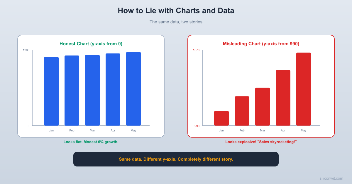
The following code plots the same sales data two ways. The first chart starts the y-axis at zero, giving an honest view of 6% total growth. The second chart starts at 990, making that same modest growth look dramatic.
print(f"\nActual growth from Jan to Jun: {actual_growth:.1f}%")
print(f"Visual bar height ratio (misleading chart): {visual_ratio:.1f}x")
print(f"The misleading chart makes a {actual_growth:.1f}% increase look like a {visual_ratio:.1f}x increase.")
Trick 2: Cherry-Picked Time Windows
By carefully choosing the start and end dates of a time series, you can make any trend look like growth, decline, or stability.
The Peak-to-Trough Trick
Imagine monthly sales data that fluctuates around a flat average. If you start your chart at a low month and end at a high month, the trend looks like strong growth. Start at a high month and end at a low month, and the same data shows alarming decline. Start at a high month and end at another high month, and you see reassuring stability. Same data, three completely different stories, controlled entirely by the time window.
Full data (18 months, flat trend with noise):
╭─╮ ╭─╮ ╭─╮ ╭─╮ ╭─╮ ╭─╮
───╯ ╰─╯ ╰─╯ ╰─╯ ╰─╯ ╰─╯ ╰───
Cherry-pick months 3-9 (trough to peak):
╭─╮ ╭─╮
───╯ ╰─╯ "Growth!"
Cherry-pick months 6-12 (peak to trough):
╭─╮
╰─╯ ╰─── "Decline!"
Engineering Examples
Performance improvements: “Our response time improved 30% this quarter!” (But last quarter had an anomalous spike due to a misconfigured load balancer. Compared to two quarters ago, the “improvement” is 2%.)
Bug counts: “We closed more bugs than we opened this sprint!” (Starting the count after a week of triage that front-loaded bug closures.)
Uptime metrics: “99.99% uptime this month!” (The major outage was last month, which conveniently falls outside the window.)
Counter: Always ask for the full history, not just the selected window. If someone shows you a time series, request a zoomed-out view that includes at least 2-3x the displayed time period.
Trick 3: Misleading Scales
Logarithmic vs. Linear
A logarithmic y-axis compresses large values and expands small ones. This is useful for data spanning several orders of magnitude (like frequency response plots or population growth), but it can mislead when the audience expects a linear scale.
On a log scale, the visual difference between 100 and 1,000 looks the same as the difference between 1,000 and 10,000. For an audience that does not notice the log scale, a 10x improvement and a 2x improvement can look identical. Conversely, a linear scale can make exponential growth look like a flat line for the early stages, hiding the coming explosion.
Use log scale when:
Data spans multiple orders of magnitude
You want to compare percentage changes rather than absolute changes
The audience is technically sophisticated and accustomed to log scales (e.g., Bode plots)
Use linear scale when:
Data spans a narrow range
Absolute differences matter more than ratios
The audience may not be familiar with log scales
Always check the axis labels. Are the gridlines evenly spaced in value (linear) or evenly spaced in powers of 10 (logarithmic)? If the y-axis reads 1, 10, 100, 1000, it is logarithmic. If it reads 0, 250, 500, 750, 1000, it is linear.
Inconsistent Axis Intervals
Another scale trick: unevenly spaced axis labels. The x-axis might read “Jan, Feb, Mar, Jun, Dec,” omitting months where the data was unfavorable. The visual spacing suggests even intervals, but the actual time gaps are uneven, distorting the slope of any trend.
Trick 4: 3D Pie Charts (and Pie Charts in General)
Why 3D Pie Charts Are Always Wrong
A 3D pie chart adds a perspective tilt that distorts slice sizes. Slices at the “front” of the chart (closer to the viewer) appear larger than slices at the “back,” even when they represent the same value. This is not a matter of preference; it is a perceptual distortion that makes accurate comparison impossible.
Even flat pie charts are poor for comparison because humans are bad at judging angles and areas. We perceive length (bar charts) and position (dot plots, scatter plots) much more accurately than area or angle.
What the data says: What the 3D chart implies:
A: 30% B: 25% A looks ~35% (front, enlarged)
C: 25% D: 20% D looks ~12% (back, compressed)
Rule: Never use 3D pie charts. For part-to-whole comparisons, use a stacked bar chart, a waffle chart, or (if you must) a flat pie chart with labeled percentages.
Trick 5: Dual Y-Axes
Plotting two different metrics on the same chart with independent y-axes can make unrelated trends look correlated.
You plot “lines of code committed per week” on the left y-axis and “customer satisfaction score” on the right y-axis. By adjusting the scale of each axis independently, you can make the two lines track each other perfectly, suggesting that more code leads to happier customers. But the correlation is manufactured by the axis scaling, not by the data. You could make any two time series “correlate” by adjusting the scales.
Dual y-axes allow the chart creator to control the visual correlation by adjusting the range, offset, and direction of each axis. Two unrelated metrics can be made to look perfectly correlated, inversely correlated, or uncorrelated, depending on how the axes are scaled. The reader has no way to judge the real relationship without seeing each metric charted independently.
Use two separate charts stacked vertically with aligned x-axes. This preserves the time alignment without implying correlation.
Normalize both metrics to the same scale (z-scores or percentage change from baseline) if you genuinely want to compare their trajectories.
Calculate the actual correlation and report it as a number, not as a visual trick.
Trick 6: Pictogram Abuse
Pictograms (using icons or images to represent quantities) introduce area distortion when scaled incorrectly.
The Height vs. Area Problem
If Country A produces 100 units and Country B produces 200 units, a common mistake is to represent this with two icons where Icon B is twice as tall as Icon A. But since the icon is also twice as wide (maintaining proportions), its area is four times that of Icon A. The visual impression is a 4x difference, not a 2x difference.
Data: A = 100, B = 200 (2x ratio)
Wrong (scale height and width):  A:  ▪         B:  ▪▪                    ▪▪  Visual area ratio: 4x (misleading)
Right (use equal-sized icons, vary quantity):  A: ▪▪▪▪▪       B: ▪▪▪▪▪▪▪▪▪▪  Visual ratio: 2x (accurate)
Rule: When using pictograms, vary the count of identically-sized icons, not the size of a single icon. Or use bar charts.
Trick 7: Simpson’s Paradox
What it is: A trend that appears in several groups of data reverses when the groups are combined. This is not a chart trick per se, but a statistical phenomenon that chart presentation can exploit.
Your company has two engineering teams. You measure code review turnaround time:
Team
Small PRs
Large PRs
Overall Average
Team Alpha
2 hours (80 PRs)
8 hours (20 PRs)
3.2 hours
Team Beta
1 hour (10 PRs)
6 hours (90 PRs)
5.5 hours
Team Alpha is faster overall (3.2 vs 5.5 hours). But Team Beta is faster in both categories: 1 hour vs 2 hours for small PRs, and 6 hours vs 8 hours for large PRs. The paradox arises because Team Beta handles a much higher proportion of large PRs, which drags up their overall average.
If you present only the overall averages, Team Alpha looks better. If you present the category breakdowns, Team Beta looks better in every category. Both presentations are factually correct, but they lead to opposite conclusions.
Whenever you see aggregated data, ask whether the subgroup compositions are similar. If they are not, the aggregate comparison may be misleading. Always check whether the conclusion holds within subgroups as well as across the aggregate. When presenting your own data, show both the aggregate and the subgroup breakdowns, and explain any discrepancies.
How to Present Your Own Data Honestly
Now that you know how charts can mislead, here is how to make sure your own visualizations are clear and honest.
Start bar chart y-axes at zero. If you need to show detail in a narrow range, use a line chart or dot plot with a clearly marked axis break.
Show the full time range. If you are highlighting a specific period, include the broader context so the reader can judge whether the period is representative.
Label everything. Axis labels, units, sample sizes, and data sources should be visible on the chart, not buried in footnotes.
Use appropriate chart types. Bar charts for comparison, line charts for trends over time, scatter plots for relationships between two variables. Never use 3D effects.
Report uncertainty. Add error bars, confidence intervals, or at minimum the sample size. A mean without a measure of spread is incomplete.
Avoid dual y-axes. If you must compare two metrics, use separate vertically-stacked panels with aligned x-axes.
Show all the data when feasible. Dot plots and strip plots that show individual data points are more informative than bar charts showing only means.
Use color and size carefully. Color should encode meaningful categories, not just decoration. Size should scale linearly with the data value.
A Checklist for Reading Charts
Use this whenever you encounter a data visualization in a report, presentation, or article:
Check the Axes
Does the y-axis start at zero? If not, is the truncation justified and clearly marked? Are the axis intervals evenly spaced? Is the scale linear or logarithmic, and is it appropriate for the data?
Check the Time Window
Does the selected time period tell the full story? What happened before and after the displayed window? Could a different start or end date change the apparent trend?
Check the Comparison
Are the groups being compared actually comparable? Are sample sizes similar? Could confounding variables (Simpson’s paradox) reverse the conclusion within subgroups?
Check the Visual Encoding
Are areas, heights, and colors used accurately? Do 3D effects or perspective distort the visual impression? Could a simpler chart type communicate the same information more honestly?
Exercises
Exercise 1: Before and After
Take a dataset from your work (benchmark results, test pass rates, or performance metrics). Create two charts from the same data: one that honestly represents the findings and one that exaggerates or misleads (using any of the tricks from this lesson). Share both versions with a colleague and see if they can identify which is misleading and why.
Exercise 2: Chart Autopsy
Find three charts in recent technical articles, blog posts, or presentations. For each chart, identify:
What story does the chart tell?
Are the axes honest (starting at zero, evenly spaced, appropriate scale)?
Is the time window representative?
Could a different chart type communicate the information more clearly?
Exercise 3: Simpson’s Paradox Hunt
Take a dataset with at least two subgroups and compute both the aggregate and subgroup statistics. Does the aggregate trend hold within each subgroup? If not, you have found a Simpson’s paradox. Write up what the data actually shows and how different presentations could lead to opposite conclusions.
Exercise 4: Dashboard Audit
Look at a dashboard your team uses regularly (CI metrics, performance monitoring, project tracking). Identify at least two ways the visualizations could be misinterpreted. Suggest specific improvements to make the dashboard more honest and harder to misread.
Exercise 5: Honest Chart Redesign
Find a chart online that uses at least one of the misleading techniques covered in this lesson (social media, news articles, and marketing materials are good hunting grounds). Redesign it to present the same data honestly. Document what changed and why the original was misleading.
Putting It All Together
This lesson completes the first five lessons of the Critical Thinking for Engineers course. You now have a toolkit for recognizing:
Lesson
Thinking Error
Your Defense
1. How Your Brain Tricks You
System 1 heuristics (anchoring, availability, substitution)
Recognize when to override intuition with deliberate analysis
2. Logical Fallacies
Flawed argument structures
Identify the specific fallacy and redirect to evidence
3. Cognitive Biases
Systematic judgment errors
Organizational debiasing (pre-mortems, red teams, checklists)
The common thread: your brain, your colleagues, and your data can all mislead you. The defense is not cynicism, but calibrated skepticism backed by specific knowledge of how each type of error works. Look at the evidence. Check the reasoning. Verify the visualization. And when you present your own work, hold yourself to the same standard you demand of others.
Comments