Skip to content

What Machine Learning Actually Is

What Machine Learning Actually Is hero image
Modified:
Published:

You already know how to fit a line to data. You have a scatter of points, you call np.polyfit, and out comes a slope and intercept. That is machine learning. Not the buzzword version, not the billion-parameter version, but the core idea stripped bare: given data, find a function that describes it. Everything else in ML, from logistic regression to deep neural networks, is a variation on this theme. This lesson makes the connection explicit, then shows you where naive curve fitting breaks down and what the real discipline of ML adds to fix it. #MachineLearning #CurveFitting #BiasVariance

Curve Fitting Is Machine Learning

If you have taken the Applied Mathematics course or any engineering math class, you have fitted curves. You measured some physical quantity, plotted it, and drew a line (or polynomial, or exponential) through the points. The goal was to capture the underlying relationship so you could predict new values.

Machine learning is the same process with three additions:

  1. The computer searches for the best fit automatically (optimization).
  2. You test the fit on data the model has never seen (generalization).
  3. You have formal tools for deciding how complex the model should be (model selection).

Let us start at the beginning.

Fitting a Line with NumPy

import numpy as np
import matplotlib.pyplot as plt
np.random.seed(42)
# Generate noisy linear data: y = 2x + 1 + noise
x = np.linspace(0, 10, 30)
y = 2 * x + 1 + np.random.randn(30) * 2
# Fit a line (degree-1 polynomial)
coeffs = np.polyfit(x, y, deg=1)
print(f"Fitted coefficients: slope = {coeffs[0]:.3f}, intercept = {coeffs[1]:.3f}")
print(f"True relationship: slope = 2.000, intercept = 1.000")
# Predict
x_pred = np.linspace(0, 10, 100)
y_pred = np.polyval(coeffs, x_pred)
plt.figure(figsize=(8, 5))
plt.scatter(x, y, color='steelblue', label='Data points')
plt.plot(x_pred, y_pred, color='tomato', linewidth=2, label=f'Fit: y = {coeffs[0]:.2f}x + {coeffs[1]:.2f}')
plt.xlabel('x')
plt.ylabel('y')
plt.title('Linear Fit with np.polyfit')
plt.legend()
plt.grid(True, alpha=0.3)
plt.tight_layout()
plt.savefig('linear_fit.png', dpi=100)
plt.show()
print("Plot saved as linear_fit.png")

This is the simplest possible ML model. You gave it data, it found the best line, and now it can predict y for any new x. The coefficients are close to the true values (slope 2, intercept 1) but not exact, because of noise. That gap between the fitted values and the true relationship is the first thing ML teaches you to think carefully about.

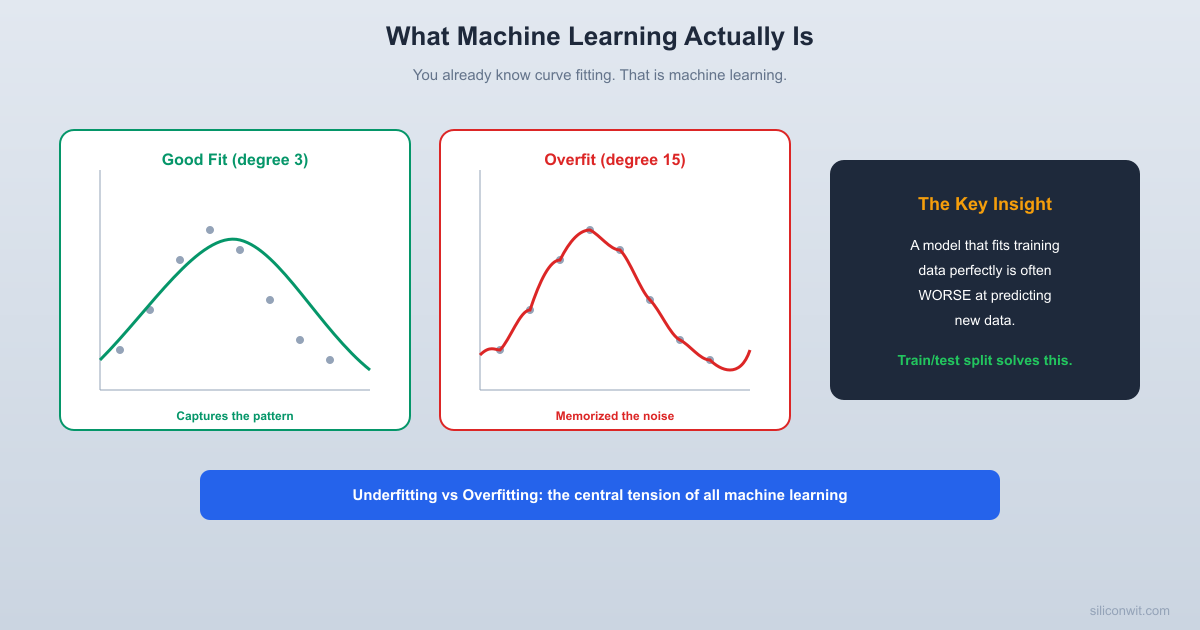
When Fitting Goes Wrong: Overfitting


What happens if you use a more flexible model? Instead of a straight line, fit a polynomial of degree 15.

import numpy as np
import matplotlib.pyplot as plt
np.random.seed(42)
# Generate data from a sine curve with noise
x = np.linspace(0, 2 * np.pi, 25)
y = np.sin(x) + np.random.randn(25) * 0.3
# Fit polynomials of different degrees
degrees = [1, 3, 15]
x_smooth = np.linspace(0, 2 * np.pi, 200)
fig, axes = plt.subplots(1, 3, figsize=(15, 4))
for ax, deg in zip(axes, degrees):
coeffs = np.polyfit(x, y, deg)
y_fit = np.polyval(coeffs, x_smooth)
# Training error
y_train_pred = np.polyval(coeffs, x)
train_mse = np.mean((y - y_train_pred) ** 2)
ax.scatter(x, y, color='steelblue', s=40, zorder=5, label='Training data')
ax.plot(x_smooth, np.sin(x_smooth), 'k--', alpha=0.4, label='True sine')
ax.plot(x_smooth, y_fit, color='tomato', linewidth=2, label=f'Degree {deg} fit')
ax.set_title(f'Degree {deg} (Train MSE: {train_mse:.4f})')
ax.set_ylim(-2, 2)
ax.legend(fontsize=8)
ax.grid(True, alpha=0.3)
plt.tight_layout()
plt.savefig('overfitting_comparison.png', dpi=100)
plt.show()
print("Plot saved as overfitting_comparison.png")
print()
print("Notice: degree 15 has the LOWEST training error but the WORST fit.")
print("It passes through every point but wiggles wildly between them.")
print("That is overfitting.")

Look at the degree-15 plot. The curve passes through (or very near) every training point. Its training error is nearly zero. But the curve wiggles wildly between points. If you fed it a new x value between the training points, the prediction would be terrible.

This is overfitting: the model memorized the noise in the training data instead of learning the underlying pattern.

The Train/Test Split: The Fundamental Idea


How do you detect overfitting? You hold out some data that the model never sees during training, then measure how well it predicts that unseen data.

import numpy as np
import matplotlib.pyplot as plt
np.random.seed(42)
# Generate 50 data points from a sine curve with noise
n_total = 50
x_all = np.sort(np.random.uniform(0, 2 * np.pi, n_total))
y_all = np.sin(x_all) + np.random.randn(n_total) * 0.3
# Split: first 35 for training, last 15 for testing
n_train = 35
x_train, y_train = x_all[:n_train], y_all[:n_train]
x_test, y_test = x_all[n_train:], y_all[n_train:]
print(f"Training samples: {len(x_train)}")
print(f"Test samples: {len(x_test)}")
print()
# Fit polynomials and measure train AND test error
max_degree = 15
train_errors = []
test_errors = []
for deg in range(1, max_degree + 1):
coeffs = np.polyfit(x_train, y_train, deg)
y_train_pred = np.polyval(coeffs, x_train)
y_test_pred = np.polyval(coeffs, x_test)
train_mse = np.mean((y_train - y_train_pred) ** 2)
test_mse = np.mean((y_test - y_test_pred) ** 2)
train_errors.append(train_mse)
test_errors.append(test_mse)
# Print key results
print(f"{'Degree':<8} {'Train MSE':<12} {'Test MSE':<12}")
print("-" * 32)
for deg in range(1, max_degree + 1):
marker = " <-- best test" if deg == np.argmin(test_errors) + 1 else ""
print(f"{deg:<8} {train_errors[deg-1]:<12.4f} {test_errors[deg-1]:<12.4f}{marker}")
# Plot train vs test error
plt.figure(figsize=(8, 5))
plt.plot(range(1, max_degree + 1), train_errors, 'o-', color='steelblue', label='Training error')
plt.plot(range(1, max_degree + 1), test_errors, 's-', color='tomato', label='Test error')
plt.xlabel('Polynomial degree (model complexity)')
plt.ylabel('Mean Squared Error')
plt.title('Train vs Test Error: The Overfitting Curve')
plt.legend()
plt.grid(True, alpha=0.3)
plt.yscale('log')
plt.tight_layout()
plt.savefig('train_test_error.png', dpi=100)
plt.show()
print("\nPlot saved as train_test_error.png")

This is the most important plot in all of machine learning. As model complexity increases:

  • Training error always decreases (more flexibility means a better fit to the training points).
  • Test error decreases at first, then increases (the model starts fitting noise instead of signal).

The best model is the one with the lowest test error. Not the lowest training error.

The Bias-Variance Tradeoff


The pattern above has a name: the bias-variance tradeoff.

The Bias-Variance Tradeoff
──────────────────────────────────────────────────
Error
|
| \ /
| \ Total Error /
| \ (U-shaped) /
| \ ___ /
| \ / \ /
| \ / \ /
| \_/ \____/
|
| Bias (high) Bias (low)
| Variance (low) Variance (high)
|
+────────────────────────────────────────────
Simple ──────► Complex
Model Complexity
Underfitting Overfitting
(too simple, (too complex,
misses the memorizes
pattern) the noise)
Sweet spot: enough complexity to capture
the pattern, not so much that it fits noise.

Bias is the error from wrong assumptions. A straight line fitted to a sine wave has high bias: no matter how much data you give it, a line can never capture the curve. It underfits.

Variance is the error from sensitivity to fluctuations in the training data. A degree-15 polynomial changes dramatically if you add or remove a single training point. It overfits.

The goal is to find the sweet spot: enough model complexity to capture the real pattern, but not so much that the model memorizes noise.

Connect to Applied Math

If you studied interpolation in the Applied Mathematics course, you saw that high-degree polynomial interpolation can oscillate wildly (Runge’s phenomenon). Overfitting in ML is the same idea: too much flexibility, not enough constraint.

Types of Machine Learning


Not every problem is curve fitting. ML breaks into three families based on the type of feedback the model receives during training.

Supervised Learning

You have input/output pairs: “given this input, the correct output is that.” The model learns the mapping.

Supervised Learning
──────────────────────────────────────
Input (features) Output (label)
────────────────── ──────────────
[temp, humidity] → "rain" or "no rain"
[voltage, current] → "defective" or "good"
[x1, x2, x3] → predicted y value
  • Regression: output is a continuous number (temperature, price, voltage).
  • Classification: output is a category (defective/good, spam/not spam, digit 0 through 9).

Most of this course focuses on supervised learning because it is the most immediately useful for engineers.

Unsupervised Learning

You have data but no labels. The model finds structure on its own.

  • Clustering: group similar data points together (k-means, DBSCAN).
  • Dimensionality reduction: compress high-dimensional data into fewer dimensions (PCA, t-SNE).
  • Anomaly detection: find data points that do not fit the normal pattern.

Reinforcement Learning

An agent takes actions in an environment and receives rewards or penalties. Over time, it learns a strategy (policy) that maximizes cumulative reward. Robotics, game playing, and control systems use reinforcement learning. We will not cover it in this course, but the gradient descent techniques you learn here apply to RL as well.

Complete Example: The Overfitting Lab


This script ties everything together. It generates a noisy sine dataset, splits it into train and test sets, fits polynomials of increasing degree, and produces three plots: the fits, the error curves, and a summary table.

import numpy as np
import matplotlib.pyplot as plt
np.random.seed(42)
# ── Generate Data ──
n_total = 60
x_all = np.sort(np.random.uniform(0, 2 * np.pi, n_total))
y_true = np.sin(x_all)
y_noisy = y_true + np.random.randn(n_total) * 0.3
# ── Train/Test Split (70/30) ──
n_train = int(0.7 * n_total)
indices = np.random.permutation(n_total)
train_idx = indices[:n_train]
test_idx = indices[n_train:]
x_train = x_all[train_idx]
y_train = y_noisy[train_idx]
x_test = x_all[test_idx]
y_test = y_noisy[test_idx]
print(f"Total samples: {n_total}")
print(f"Training samples: {len(x_train)}")
print(f"Test samples: {len(x_test)}")
print()
# ── Fit Polynomials of Increasing Degree ──
degrees = list(range(1, 16))
train_mse_list = []
test_mse_list = []
x_smooth = np.linspace(0, 2 * np.pi, 300)
for deg in degrees:
coeffs = np.polyfit(x_train, y_train, deg)
pred_train = np.polyval(coeffs, x_train)
pred_test = np.polyval(coeffs, x_test)
train_mse = np.mean((y_train - pred_train) ** 2)
test_mse = np.mean((y_test - pred_test) ** 2)
train_mse_list.append(train_mse)
test_mse_list.append(test_mse)
# ── Print Summary Table ──
best_deg = degrees[np.argmin(test_mse_list)]
print(f"{'Degree':<8} {'Train MSE':<14} {'Test MSE':<14} {'Status'}")
print("=" * 50)
for i, deg in enumerate(degrees):
if deg < best_deg:
status = "underfitting"
elif deg == best_deg:
status = "BEST"
elif test_mse_list[i] > test_mse_list[i - 1]:
status = "overfitting"
else:
status = ""
print(f"{deg:<8} {train_mse_list[i]:<14.6f} {test_mse_list[i]:<14.6f} {status}")
print(f"\nBest polynomial degree: {best_deg}")
print(f"Best test MSE: {test_mse_list[best_deg - 1]:.6f}")
# ── Plot 1: Three Example Fits ──
fig, axes = plt.subplots(1, 3, figsize=(15, 4))
example_degrees = [1, best_deg, 15]
for ax, deg in zip(axes, example_degrees):
coeffs = np.polyfit(x_train, y_train, deg)
y_smooth = np.polyval(coeffs, x_smooth)
pred_test = np.polyval(coeffs, x_test)
test_mse = np.mean((y_test - pred_test) ** 2)
ax.scatter(x_train, y_train, color='steelblue', s=25, alpha=0.7, label='Train')
ax.scatter(x_test, y_test, color='orange', s=25, alpha=0.7, label='Test')
ax.plot(x_smooth, np.sin(x_smooth), 'k--', alpha=0.3, label='True sine')
ax.plot(x_smooth, y_smooth, color='tomato', linewidth=2, label=f'Degree {deg}')
ax.set_title(f'Degree {deg} (Test MSE: {test_mse:.4f})')
ax.set_ylim(-2.5, 2.5)
ax.legend(fontsize=7)
ax.grid(True, alpha=0.3)
plt.tight_layout()
plt.savefig('overfitting_lab_fits.png', dpi=100)
plt.show()
# ── Plot 2: Error vs Complexity ──
plt.figure(figsize=(8, 5))
plt.plot(degrees, train_mse_list, 'o-', color='steelblue', label='Training MSE')
plt.plot(degrees, test_mse_list, 's-', color='tomato', label='Test MSE')
plt.axvline(x=best_deg, color='green', linestyle=':', alpha=0.7, label=f'Best degree = {best_deg}')
plt.xlabel('Polynomial Degree (Model Complexity)')
plt.ylabel('Mean Squared Error')
plt.title('Bias-Variance Tradeoff in Action')
plt.legend()
plt.grid(True, alpha=0.3)
plt.tight_layout()
plt.savefig('overfitting_lab_error_curve.png', dpi=100)
plt.show()
print("\nPlots saved: overfitting_lab_fits.png, overfitting_lab_error_curve.png")

Run that script. Study the three fits side by side. Look at the error curve. The pattern is unmistakable: training error always goes down, but test error hits a minimum and then climbs. That U-shaped test error curve is the signature of the bias-variance tradeoff, and recognizing it is the single most important skill in practical machine learning.

Key Takeaways


  1. ML is curve fitting, generalized. You have data, you find a function that describes it. np.polyfit is a machine learning algorithm.

  2. Always evaluate on unseen data. Training error tells you how well the model memorized. Test error tells you how well it generalizes. Only test error matters.

  3. Underfitting means your model is too simple. It cannot capture the real pattern. Increase complexity (more features, higher degree, more flexible model).

  4. Overfitting means your model is too complex. It captures noise along with the signal. Reduce complexity, get more data, or add regularization (Lesson 7).

  5. The bias-variance tradeoff guides every decision. Every model choice, from polynomial degree to neural network depth, trades bias for variance. Your job is to find the sweet spot.

What is Next


In Lesson 2: Linear Regression and Prediction, you will move from single-variable polynomial fitting to multi-feature linear regression using scikit-learn. You will build a sensor data pipeline, learn feature scaling, and evaluate your model with proper metrics.

Comments

Loading comments...


© 2021-2026 SiliconWit®. All rights reserved.