

Supply and minimum voltage
Record both. Sags live entirely in the minimum and are invisible to the instantaneous reading.
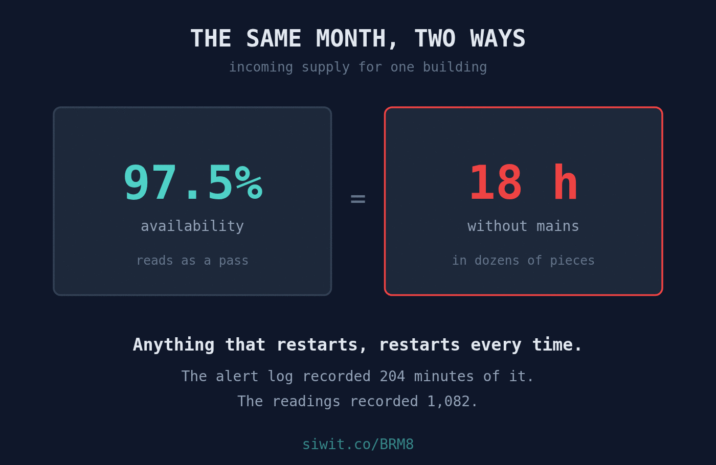
A tenant calls to say their equipment restarted. The building manager checks, finds the power on, and says it looks fine from here. Both of them are telling the truth, and neither of them can settle it, because the event they are discussing lasted four minutes and finished an hour ago. #SmartBuildings #RemoteMonitoring #PowerQuality
Monitoring on the incoming supply for a whole building. The owner’s reason for it is a single sentence and it is about people rather than equipment: tenants ask what happened, and now they can be told.
Over the last month the alert log recorded 30 separate mains outages, totalling 204 minutes. The longest was 14 minutes, the shortest was one.
The readings underneath tell a larger story. Summed across the month, this supply spent 1,082 minutes without mains, which is just over 18 hours:
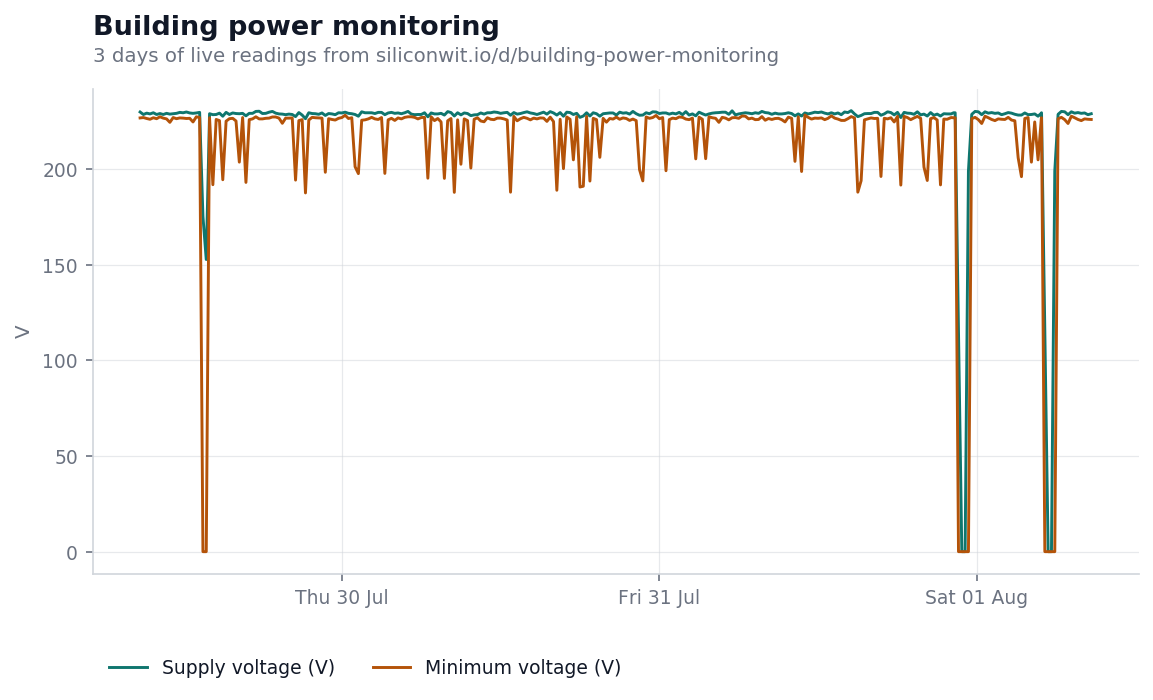
Two lines that are usually close together and occasionally are not.
Supply voltage is the value at the moment of sampling, averaging 224.4 V here. Minimum voltage is the lowest the supply reached within each reporting window, averaging 214.4 V. The gap between those two numbers is the more interesting reading, because it is where the sags live.
A sag is a voltage dip too brief to be called an outage and quite long enough to reset a controller, drop a session or trip a motor starter. It will not appear in the instantaneous line at all unless you sample exactly at the wrong moment. It appears reliably in the minimum, and that is the whole reason the minimum is recorded separately.
Then there are the interruptions, where both lines go to zero together. Thirty of them in a month, none longer than a quarter of an hour.
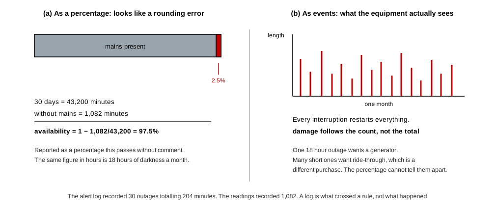
It is worth stopping on 97.5%, because that number is the reason nothing was ever done about this.
Availability expressed as a percentage flatters short frequent failures. Two and a half per cent unavailability sounds like a rounding error. Spread over a month it is eighteen hours, and delivered as dozens of separate events it is considerably more damaging than one eighteen hour outage would be. Anything that restarts, restarts every time. Anything with a spin up cost pays it every time. Every one of those events is a fresh opportunity for a file to be written half way.
There is a second lesson in the gap between the 204 minutes in the alert log and the 1,082 minutes in the readings. An alert log is a record of what crossed a rule, not a record of what happened. Anything that fell below the rule’s threshold, or arrived while an alert was already open, is missing from it. If you are judging a supply, judge it on the measurement and use the log to navigate.
Frequency and duration are different quantities and they do different damage. A supply that fails once for eighteen hours is a supply problem. A supply that fails dozens of times for a few minutes is a reliability problem, and the two want opposite responses: the first wants a generator, the second wants ride-through.
A monthly availability figure would have shown this building as healthy. Neither the percentage nor the alert log, on its own, shows what is actually happening.
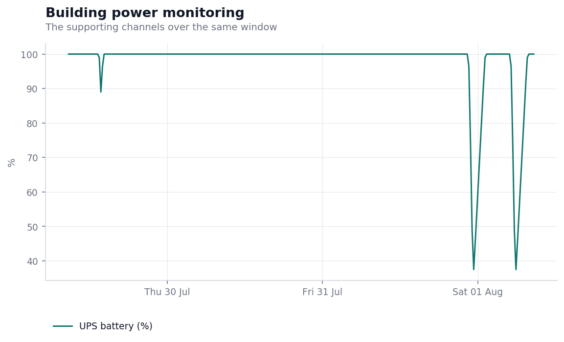
The UPS battery chart is where this gets worse, and it is not the chart anyone would have gone looking for.
Across the month this building raised seven separate UPS battery low alerts, and they descend: 31%, 30%, 28%, 18%, 16%, 14%, and 12%. A UPS reaching 12% is a UPS that came close to not making it.
The mechanism is straightforward once the outage frequency is in front of you. A battery needs longer to recharge than to discharge. When interruptions arrive every day or two, the bank starts each one from a lower state of charge than the last, and its effective ride-through shrinks with every event. The battery was never failing. It was never being given time to recover.
That is a conclusion only available from two readings together. Outage frequency alone looks survivable. Battery charge alone looks like an ageing bank due for replacement, which is an expensive and completely wrong diagnosis. Read side by side, they say the supply is the problem and the battery is the symptom.
The numbers below are a worked example, not a promise. Put your own figures in.
The direct value is in the arguments it ends. A tenant reporting an unexplained restart can be answered in seconds with a timestamp and a duration, and the answer is either yes, the building lost mains at 15:47 for six minutes, or no, it did not and the fault is inside your suite. Both answers are worth having, and the second one is worth more.
Against that:
Supply and minimum voltage
Record both. Sags live entirely in the minimum and are invisible to the instantaneous reading.
Outage count and duration
Count and length separately. Thirty short failures and one long one produce the same availability figure and completely different damage.
UPS battery state of charge
Read against outage frequency, never alone. A bank that cannot recover between events looks exactly like a bank that is worn out.
Harmonic distortion
Slow moving and worth trending. A rising figure points at load being added somewhere in the building without anyone mentioning it.
The other smart building installations answer similarly human questions. An office HVAC air handler is monitored in part to settle arguments about whether it is actually running. Tenant water monitoring watches shared tanks to establish who used what, and whether the pump is short cycling again. In both cases the instrument is really there to replace a disagreement with a number.
The power quality argument runs elsewhere in the fleet too. A UPS and power quality monitor went in after equipment kept failing and nobody could say why, and the answer turned out to be sags rather than the equipment. A server room cooling unit is watched mainly to know how much headroom is left in the hottest week of the year.
The device page shows the live readings, the charts above in their interactive form, and the full outage and battery alert history. If the device link below ever stops resolving, the public device gallery lists everything currently shared, and devices come and go from it as owners decide.
To put your own supply on a chart, you can send readings without creating an account and see them arrive on a live chart in a couple of minutes, or read how to connect a first device.
Open this device Monitor your own equipment
Comments