

Irradiance at the array
The channel that makes every other number interpretable. Without it, generation is uninterpretable rather than merely noisy.
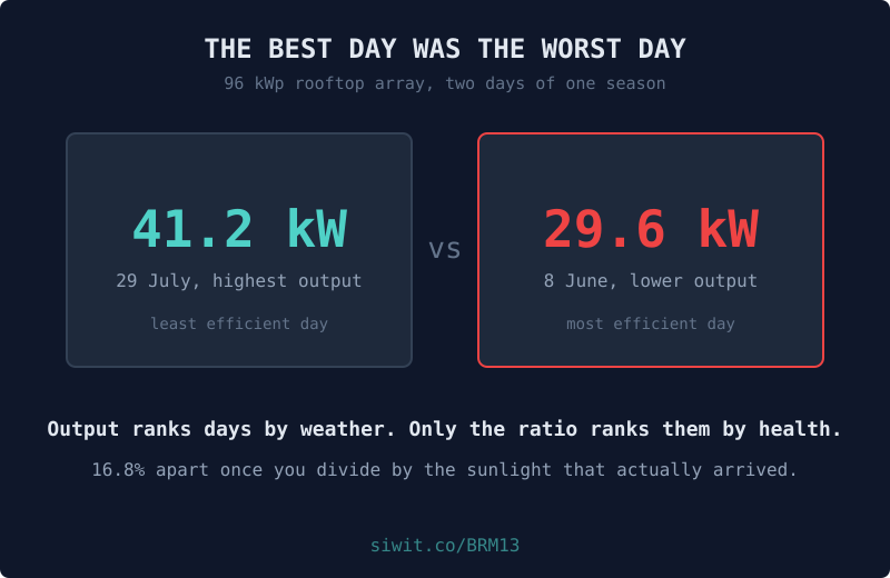
An array that is 16% dirty on a bright day still out-produces a clean array on a dull one. That single sentence is why solar underperformance goes unnoticed for years: the fault is smaller than the weather, and output puts them both on the same axis with no way to separate them. #EnergyAndPower #RemoteMonitoring #Solar
96 kWp across a light-industrial warehouse roof, reading generation, site load, what goes to and from the grid, panel temperature, and the irradiance actually falling on the array.
That last channel is the one that matters and the one most installations skip. The owner checks yield against irradiance most mornings, and when it drifts below where it should be, the panels want washing.
Every figure in this post is measured over one fixed window, 28 May to 7 August 2026, which is the window the charts show. Naming it matters: these devices keep running, so a claim about “the last ten weeks” stops being true the week after it is written, while a claim about a named window stays checkable against the chart above it forever.
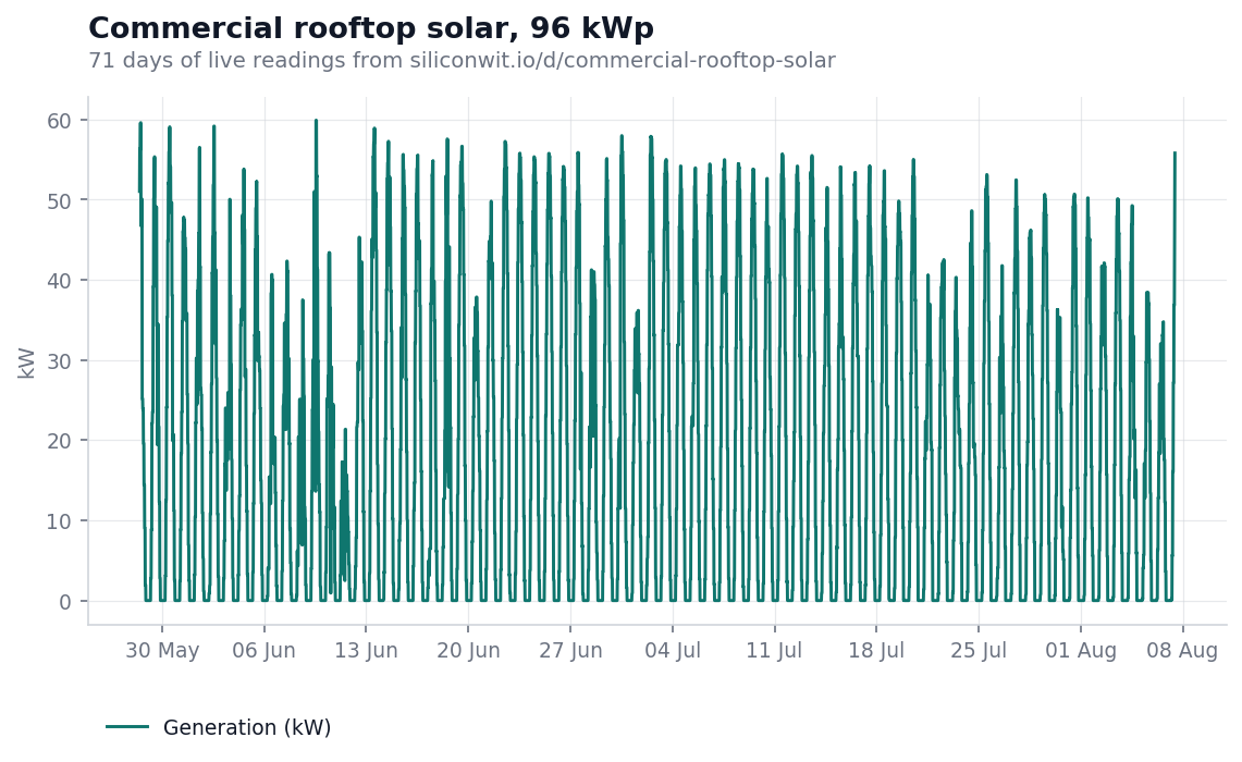
Seventy one days of generation. Good days and bad days, a band that moves around with cloud, and nothing that looks like a fault.
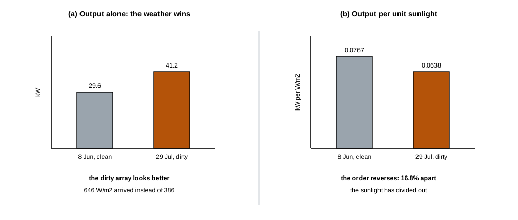
Now the two days worth naming. On 8 June the array averaged 29.6 kW through the usable part of the day. On 29 July it averaged 41.2 kW, thirty nine percent more.
By output, 29 July is comfortably the better day. Hold that.
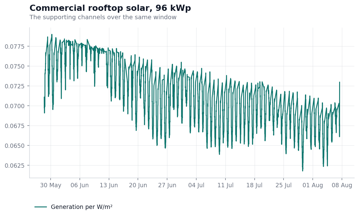
This is generation divided by the irradiance measured at the array, in kilowatts per watt per square metre. It is the same data. It is not the same picture.
The band drifts downward across the season, and the two days above swap places completely:
The highest output day of the season was the least efficient day of the season, by a wide margin. Output was high because 646 W/m² arrived instead of 386. The array converted a smaller fraction of it than on any other day recorded.
Across the whole window, comparing the first week with the last:
That is the array losing about a tenth of its conversion in ten weeks, on a roof, at a rate that never once produced a bad-looking day.
Generation is the product of two things, only one of which says anything about the array. Writing irradiance as G, efficiency as eta and array area as A:
Irradiance varies by a factor of several between a dull morning and a clear noon. Efficiency changes by a few percent over months. Plot the product and the large fast term buries the small slow one, permanently.
Divide by irradiance and the weather cancels. What is left moves only when the array changes, which is exactly the question an owner is asking and never quite gets an answer to.
Two honest caveats. Panel temperature costs output too, roughly half a percent per degree above 25 °C, and this array reached 59.6 °C, so part of any single hot day’s dip is thermal rather than dirt. And if your irradiance sensor is itself dirty, it under-reads, the ratio flatters the array, and a healthy looking number can hide real degradation. Clean the reference cell when you clean the panels.
The numbers below are a worked example, not a promise. Put your own figures in.
A 10.3% conversion loss on a 96 kWp array is not a subtle number. Against a nominal annual yield, losing a tenth of it is the difference between the payback period in the proposal and the one you actually get, and nothing on the inverter display will ever mention it.
Irradiance at the array
The channel that makes every other number interpretable. Without it, generation is uninterpretable rather than merely noisy.
Generation per unit irradiance
The health number. Track it against itself over weeks, not against a target.
Panel temperature
Separates a hot day from a dirty array, which otherwise look similar in the ratio.
Export against site load
A different question entirely: not whether the array is well, but whether you are using what it makes.
A campus solar demonstrator runs the same instrument set at teaching scale, where the point is that students can see where the losses go. An off-grid tower site puts solar, a battery bank and a generator on one site, where the question becomes fuel rather than yield, covered in its own post.
This post is an instance of a general habit: when a measurement is dominated by something you do not control, divide it out and look at what remains. The correlation, causation and evidence lesson calls the uncontrolled term a confounder, and normalising against it is the cheapest control available when you cannot run an experiment.
The device page shows the live readings, the charts above in their interactive form, and the alert history. If the device link below ever stops resolving, the public device gallery lists everything currently shared, and devices come and go from it as owners decide.
To put your own array on a chart, you can send readings without creating an account and see them arrive on a live chart in a couple of minutes, or read how to connect a first device.
Open this device Monitor your own equipment
Comments