

PM2.5 and PM10 together
Never one without the other. Their ratio identifies the source, and their ordering is a built-in sanity check.
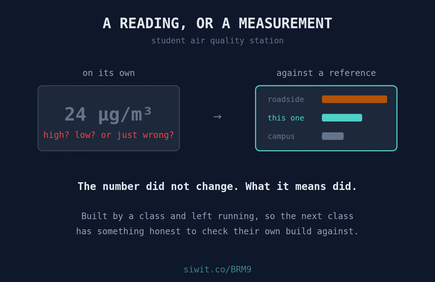
The hard part of teaching measurement is not wiring the sensor. Students get a board talking in an afternoon. The hard part is the next question, the one that decides whether they have learned instrumentation or just soldering: how do you know that number is right? #Education #RemoteMonitoring #AirQuality
An air quality station built by a class and deliberately left public, so that the next cohort can compare their own build against it.
That last clause is the entire design decision, and it is a better one than it first appears. The station’s value is not the data. It is that the data is still there next year, taken by an instrument whose provenance is known, at a location that has not moved.
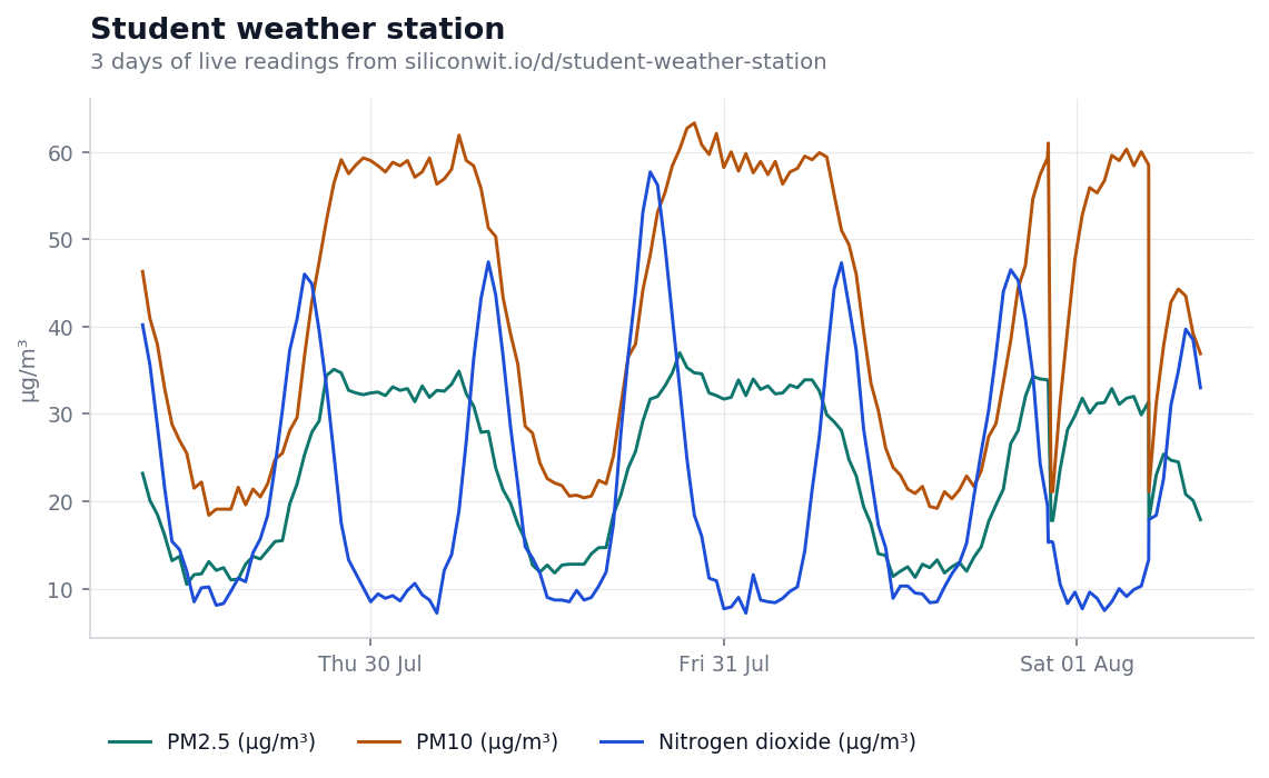
Three pollutants on one axis, because they share a unit and because the relationship between them carries most of the teaching.
Over this window PM2.5 averaged 24.1 µg/m³ with a peak of 37.0, PM10 averaged 41.9 µg/m³ with a peak of 63.3, and nitrogen dioxide averaged 20.6 µg/m³ with a peak of 57.7.
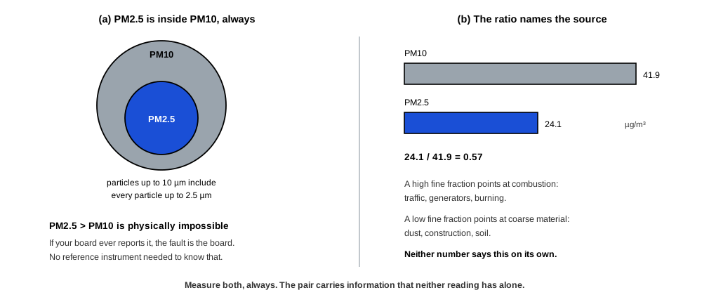
The first thing to notice is that PM2.5 is always below PM10, and that this is not a coincidence or a calibration artefact. PM10 is defined as particles up to 10 micrometres, which includes everything counted as PM2.5. One is a subset of the other, so PM2.5 exceeding PM10 would be physically impossible and is an immediate sign of a fault. That single check is worth teaching on its own: some errors are detectable from internal consistency, with no reference instrument needed at all.
The second is the ratio:
A high fine fraction points at combustion, which is traffic, generators or burning. A low fine fraction points at coarse material, which is dust, construction or soil. The ratio says something about the source that neither number says alone.
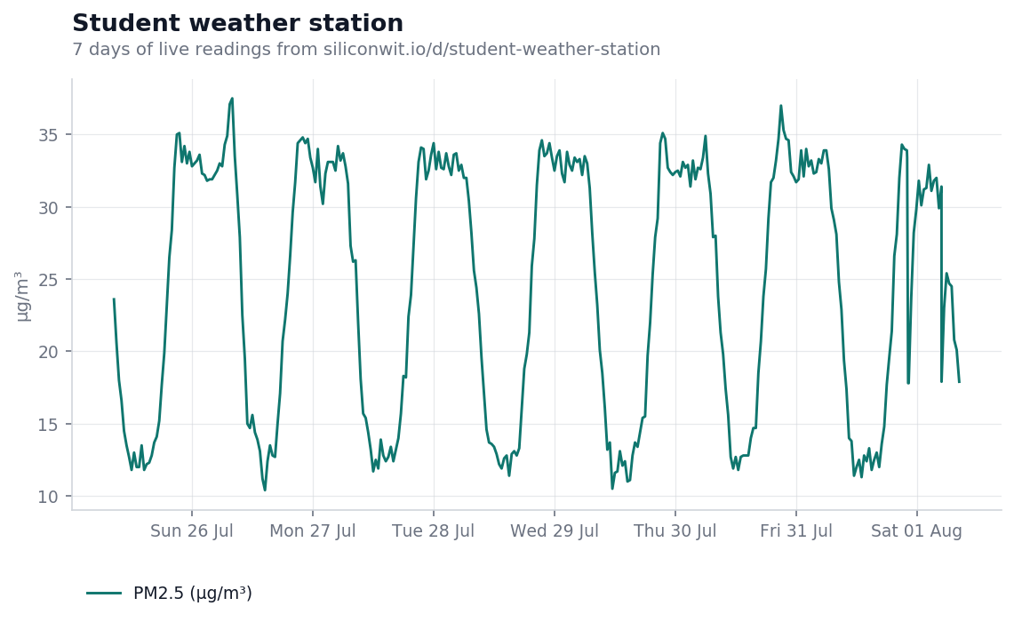
Here is a week of PM2.5 from the same station, and it is the more useful chart for a class.
A single reading of 24 µg/m³ is not a result. It cannot distinguish between a genuinely polluted morning, a normal afternoon, a sensor reading 30% high, and a board sitting too close to a car park. All four produce a number and the number looks identical.
What makes it a measurement is comparison, and there are three kinds worth teaching:
Against itself over time. The weekly chart shows the same daily shape repeating. Once a station has a week of history, an unusual day is visible as unusual, and no external reference is required to see it. This is the cheapest form of calibration available and most projects skip it.
Against a known instrument at a known place. This is what the public reference fleet is for. A class can hold its own numbers against the campus air monitoring station, which is deliberately sited as a clean baseline, and against roadside air quality, which sits beside a busy road. If the class board tracks the campus baseline, it is probably working. If it tracks neither, something is wrong with the build.
Against a contrast that should exist. The roadside station’s owner noted that mornings were worse than expected, because still air holds everything in until the sun gets up. A student station that shows no morning peak at all, in a place where one should exist, has found a problem with itself rather than with the air.
Most student projects end at the demonstration. The board works, the report is marked, the hardware goes in a drawer, and the following year the next class starts from nothing.
Leaving the station running and public changes what the exercise is. The first cohort is no longer building a sensor, they are establishing a baseline that somebody else will be measured against. That reframing does a few things a normal project cannot:
There is a lesson here that carries well past air quality. A device that nobody looks at after commissioning slowly stops being trustworthy and nobody notices. A device that somebody compares against every year stays honest, because a fault shows up as a disagreement.
The value here is not financial and it would be dishonest to build a return on investment case for a teaching station. It is worth stating what it does buy.
PM2.5 and PM10 together
Never one without the other. Their ratio identifies the source, and their ordering is a built-in sanity check.
Peak as well as current
Short pollution events sit between samples. The peak within each window is what catches a passing lorry.
Nitrogen dioxide
A traffic marker. When it moves with the fine fraction and not with the coarse, the source is combustion.
Temperature and solar radiation
Explains the daily cycle. Still cold mornings trap pollutants, and the sun breaking through is what disperses them.
The other education installations are built on the same principle of being worth looking at more than once. A campus solar demonstrator lets students see where the losses go rather than taking the lecturer’s word for it. A classroom environment monitor makes CO2 climbing through a lesson visible, after which nobody argues about opening a window.
For the comparison this post is about, the two stations to hold this one against are campus air monitoring, the clean baseline, and roadside air quality, sitting beside traffic. Reading all three together is the exercise.
The device page shows the live readings and the charts above in their interactive form. If the device link below ever stops resolving, the public device gallery lists everything currently shared, and devices come and go from it as owners decide.
To put your own build on a chart, you can send readings without creating an account and see them arrive on a live chart in a couple of minutes, or read how to connect a first device.
Open this device Monitor your own equipment
Comments