

Minimum voltage per window
Not the average. An average over ten minutes erases a 200 millisecond dip completely, which is exactly the event you are hunting.
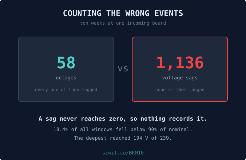
There is a particular kind of argument that happens in buildings where equipment keeps dying. The maintenance side says the supply is bad. The supply side says the outage log shows the supply was fine. Both are reading real records, and both are right, because the record everyone is arguing about does not contain the events doing the damage. #EnergyAndPower #RemoteMonitoring #PowerQuality
Monitoring at the incoming board of a building on mains with a UPS behind it, reading supply voltage, the minimum voltage inside each window, frequency, harmonic distortion, and how long the UPS battery would last if the mains went now.
The owner installed it after a run of equipment failures that nobody could explain. Their conclusion, once the data arrived, was that it was sags rather than the equipment. This post is the arithmetic behind that sentence.
Every figure in this post is measured over one fixed window, 28 May to 7 August 2026, which is the window the charts show. Naming it matters: these devices keep running, so a claim about “the last ten weeks” stops being true the week after it is written, while a claim about a named window stays checkable against the chart above it forever.
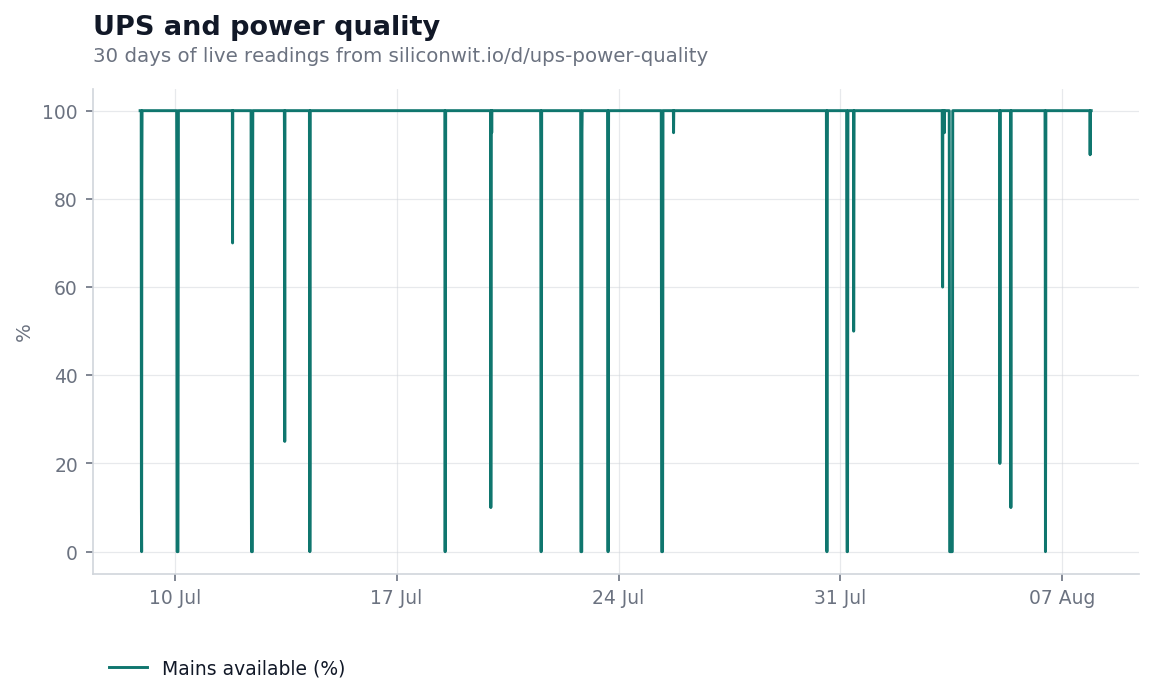
This is mains availability, the number that goes in the report. For most of the window it reads 100%, dropping only when the supply genuinely failed. Across the full ten weeks the meter recorded
That is a real and irritating number, and it is the number the whole building talks about. It is also the wrong place to look for the cause of equipment failure, because a machine that is switched off by an outage is not being damaged by it. It stops, the generator picks up, it starts again.
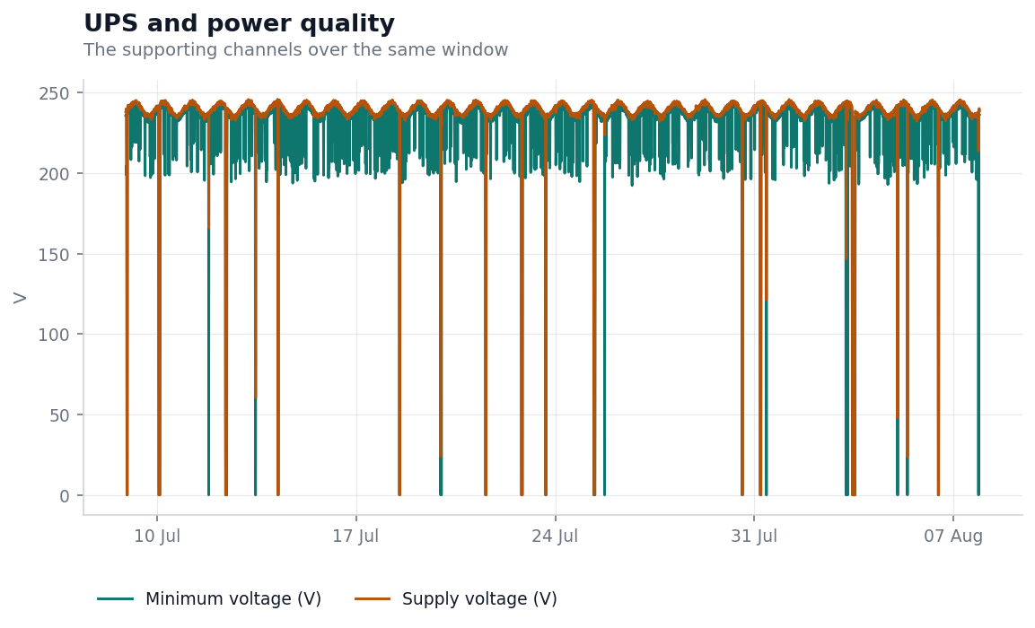
Two channels over the same window. The upper trace is supply voltage, sitting at its nominal 239.8 V and dropping vertically to zero at each outage. Those drops to zero are the 63 events everybody knows about.
The lower trace is the minimum voltage seen inside each reporting window, and it is a different picture entirely. It dips constantly. It dips to 210, to 205, to 200, and at its worst to 192.2 V, and it does this without the supply ever reaching zero. Nothing switched off. Nothing was logged as an outage. Availability still reported 100% for that window.
Counted properly over the ten weeks:
Using the conventional definition of a sag, a dip below 90% of nominal,
the minimum voltage fell below that line in 1,308 of 10,366 reporting windows, which is
Not 12.6% of a bad week. 12.6% of the whole ten weeks.
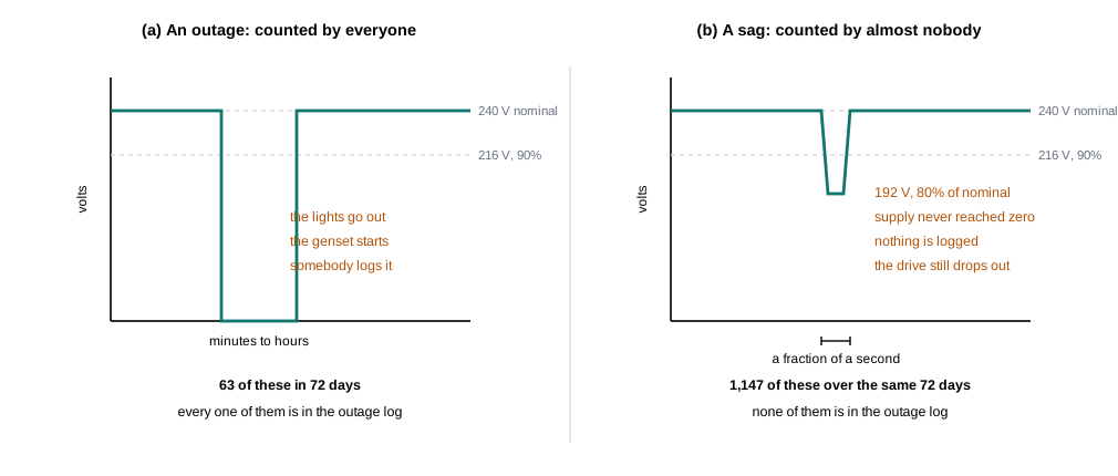
The deepest sag here reached
which sounds survivable and is not. A contactor releases below about 80%. A variable speed drive trips on undervoltage and needs a manual reset. A switched-mode supply rides it out by pulling proportionally more current, which is the part that does the quiet damage: the same power through a lower voltage means more amps, more heating in the windings and the capacitors, every time.
That gives the failure the shape monitoring handles best and inspection handles worst:
The numbers below are a worked example, not a promise. Put your own figures in.
The asymmetry is unusually stark here because the measurement is so cheap. One monitoring point at the incoming board covers everything downstream of it. Against that:
Watching costs one instrument at one board. Not watching costs a recurring equipment bill that is filed under the wrong heading, which is the version of a cost that never gets challenged because nobody has connected it to anything.
Minimum voltage per window
Not the average. An average over ten minutes erases a 200 millisecond dip completely, which is exactly the event you are hunting.
Sag count against outage count
Two separate tallies. The ratio between them is the argument, and on this installation it is over eighteen to one.
Harmonic distortion
Distortion rising with load points at something on your own side of the meter rather than at the utility.
UPS battery state
How long the protection would actually hold, measured rather than assumed from the rating.
Building power monitoring watches the same class of supply for a multi-tenant block, and its own post takes the other half of this argument: how thirty logged outages can add up to a number that reads like healthy availability. Where there is no usable grid at all, an off-grid tower site runs on solar, battery and a generator, and the fuel reconciliation post covers what goes wrong there instead.
For the equipment on the receiving end of all this, a production line drive motor and an injection moulding machine are both on the public fleet with bearing temperature and vibration, which is where repeated undervoltage eventually shows up as wear.
That everybody counts outages and nobody counts sags is availability bias with a switchboard attached: the events that announce themselves are the events that get recorded. The cognitive biases in engineering lesson works through why the vivid event crowds out the frequent one.
The device page shows the live readings, the charts above in their interactive form, and the alert history including the outages this post counts. If the device link below ever stops resolving, the public device gallery lists everything currently shared, and devices come and go from it as owners decide.
To put your own board on a chart, you can send readings without creating an account and see them arrive on a live chart in a couple of minutes, or read how to connect a first device.
Open this device Monitor your own equipment
Comments